Category: Interior Finishes
-
Wallpaper Wonders
Mention the word wallpaper, and homeowners conjure up the vision of their grandmother’s flocked velvet prints and old-fashioned busy designs and remember the miserable task of having to scrape it off years later. However, today’s wallpaper is back and better than ever and new technologies are making them easier apply and adhere better. If you’re…
-
Pantries
Want to take your kitchen from great to spectacular? Consider adding a walk-in pantry. While adding a pantry may feel as if you are taking up valuable cabinet space, if it is carefully tailored to your household’s storage needs, it can add functionality and increase organization. Corner pantries are perfect for small kitchens with unused…
-

Beyond Beige
When it comes to selecting tile for your home remodel, the abundance of options is daunting. While the material, shape, and size of the tile may be an issue of functionality, the color and texture of the tile can set the tone of a room. An unexpected source, The Wall Street Journal, recently offered an…
-
Novel Bookcase Ideas for the Home
“A room without books is like a body without a soul.” Marcus Tullius Cicero In these fast-paced times, reading the news or the latest best seller is often done on a tablet, phone, or computer. From kids to adults, its pinch, swipe, and shuffle, back and forth between groups of icons. However, for many, nothing…
-

The Power of Three
There are many elements that drive a design: structural requirements, costs, and functionality, to name a few. However, there is an easy rule, used by many designers to create an aesthetically-pleasing, well-pulled together room. The Rule of Three is a principle used in many areas of design: architecture, graphic design, and photography (though, in graphic design and photography,…
-
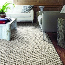
Hip to be Square
Stylish. Simple. Affordable. Eco-Friendly. It’s not too often that one can describe a product with all four of these attributes. Yes, there is home product that exists that is stylish, simple, affordable and eco-friendly. We are referring to FLOR Carpet Design Squares. Although, it has been around since 2003, we recently had a client come…
-
Don’t Forget Your Fifth Wall
To many homeowners, a ceiling is just a ceiling – a large, flat, boring, surface that all too often is ignored, receiving nothing more than a coat of flat, white paint. However, a ceiling, sometimes called “The Fifth Wall” is an opportunity to create a unique and dramatic element in your home. As part of…
-
Color Forecast 2014
“The state of color is constantly changing and gathers influence from the world around us,” says Jackie Jordan, director of color marketing for Sherwin-Williams. Each year Jordan, along with her color experts, surveys these swirling global currents and selects key colors that capture a picture of the latest color trends. For the Sherwin-Williams Colormix 2014…
-
Color of the Year for 2014 – Radiant Orchid
The Pantone Color Institute, a global color authority, announced that Radiant Orchid, a captivating, magical, enigmatic purple, as the Color of the Year for 2014. “While the 2013 color of the year, Emerald, served as a symbol of growth, renewal and prosperity, Radiant Orchid reaches across the color wheel to intrigue the eye and spark…
-
Universal Design in the Kitchen
Universal Design (UD) is an architectural movement that seeks to create living environments that function well for everyone, regardless of age or ability. In Europe it is called “Design for All”. A growing trend in this country is to use the term “Better Living Design” so people do not confuse UD with accessible design. UD…