01 May / 2014
The Front Porch is Back
During the last few decades, the front facade of most new suburban homes was dominated by a garage. This placement of the garage was convenient for homeowners who wanted to quickly enter their homes after work and put all the noise and confusion of the day behind them. If they wanted to spend time outside, they went to their private deck or patio out back. Family life centered around the backyard.
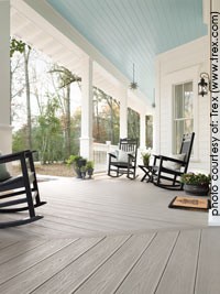 Today’s families are happily rediscovering the advantages of the front porch. A front porch provides opportunities for people to meet and connect with their neighbors, often developing meaningful relationships. These shared experiences tie neighborhood families together and help create a sense of community.
Read More
15 Apr / 2014
Transcend the Ordinary with Concrete
By Mark Lesnick
Founder, Mark Concrete
When I dream about remodeling my bathroom, I think about the new tub, maybe a steam shower, and certainly a gleaming new showpiece-of-a-vanity. I start the planning in my head – the textures, colors and styles. And then the demolition, the chaos, the mess! You may ask yourself, “How can I get the bathroom I’m envisioning with the least amount of mess and stress?” One way is a “Turn-key” bathroom vanity. It is a remarkable concept we developed to create a gorgeous work-of-art in a bathroom vanity that is simple to install and impresses the most discerning eye.
The “Turn-key” vanity system features a concrete surround with integrated sink and pre-installed cabinetry. All that is required is to set the complete vanity structure in place, install the fixture of your choice, and hook up the supply and drain lines and you are done with that portion of your new bathroom. One example of these turn-key vanities is pictured here with an “Erosion” sink mold.
Read More
01 Apr / 2014
New Design Directions for Kitchens
This year the International Builders Show (IBS) and the Kitchen and Bath Industry Show (KBIS) joined forces for one fabulous Design and Construction Week in February. Co-locating in Las Vegas, the building industry trade shows attracted more than 75,000 attendees. Remodelers, kitchen & bath designers, and builders crowded together in the aisles, anxious to see and experience all the new product introductions from cabinet and appliance manufacturers, etc.
Read More
15 Mar / 2014
Don’t Forget Your Fifth Wall
To many homeowners, a ceiling is just a ceiling – a large, flat, boring, surface that all too often is ignored, receiving nothing more than a coat of flat, white paint. However, a ceiling, sometimes called “The Fifth Wall” is an opportunity to create a unique and dramatic element in your home.
As part of a designing a remodeling project, keep in mind that the architectural details of a ceiling make their way into our consciousness when we take in the view of an entire room. Pattern, color, and texture on the ceiling can transform the look and feel of a room.
Below are four stylistic details that add architectural interest and pull the entire room together: crown molding, ceiling paint color, medallions and other material coverings.
Read More
01 Mar / 2014
Color Forecast 2014
“The state of color is constantly changing and gathers influence from the world around us,” says Jackie Jordan, director of color marketing for Sherwin-Williams. Each year Jordan, along with her color experts, surveys these swirling global currents and selects key colors that capture a picture of the latest color trends. For the Sherwin-Williams Colormix 2014 forecast, Jordan has chosen 38 colors that are grouped into the four palettes she describes below. Feel free to use these colors as design inspiration when planning your next home remodeling project.
Read More
15 Feb / 2014
John’s Split Pea Soup
Meat
4 slices bacon
2 large ham hocks, meaty
Vegetables
2 lbs split peas (dry) rinsed and drained
2 medium yellow onions, minced
6 bulbs garlic, minced
4 stalks celery w/leaves, chopped into ½” cubes.
3 large carrots, peeled and chopped into ½” cubes
1 large box chicken broth [or more]
Water as needed
Spices
½ tsp thyme (French)
2 bay leaves
¼ cup parsley, chopped fine and added with peas
Sea salt to taste
Black pepper to taste
Options
3 cups leeks chopped (1/3 white, 1/3 lt. green 1/3 green) substitute for yellow onions
½ cup Swiss chard stems, chopped and added in lieu of onions
1-2 cups leafy greens [Swiss chard, collards, kale, arugula, parsley, celery leaves, etc.] stems removed chopped fine and added with peas
½ tsp rosemary or oregano added with peas
Cut up bacon into ½” squares. Sauté bacon in a large stock pot over medium heat until crisp and brown. Remove bacon and drain on paper towels. When cool, crumble and set aside. Do not discard fat.
Add onions, garlic, celery, carrots (and/or options) to bacon fat. Sauté until vegetables begins to soften-about 6-12 minutes.
Add chicken broth, split peas, ham hock, thyme, bay leaves, and options (if desired) and enough water to cover all ingredients. Bring to a boil. Reduce heat to medium-low. Cover and simmer until peas start to break down- between 45 and 90 minutes, stirring occasionally. More water may need to be added.
Remove lid and simmer for approximately 20-30 minutes, uncovered, until desired consistency is reached. Remove ham hock and bay leaves, chop-up ham and return to soup. Season to taste with salt and pepper.
Pour soup into individual bowls. Garnish with with toppings of your choice: crumbled bacon, shredded cheddar cheese, green onions, croutons, etc.
01 Feb / 2014
How to Reduce Waste in the Kitchen
The idea that we should do our best to preserve our limited natural resources has really take hold in the U.S. Homeowners are now motivated to achieve a sustainable lifestyle. Still they are often unaware of several of the approaches they can take. For example, consider one of the areas where the typical American family generates the most trash: the kitchen.
On a regular basis, after you are finished cooking, you may be faced with numerous empty metal cans, glass jars, cardboard boxes, styrofoam containers, and plastic bottles. You may also have a mound of left over fruit and vegetable trimmings, egg shells and coffee grounds. Perhaps you have been wondering what is the most convenient and responsible way to dispose of all these items.

Read More
15 Jan / 2014
Color of the Year for 2014 – Radiant Orchid
The Pantone Color Institute, a global color authority, announced that Radiant Orchid, a captivating, magical, enigmatic purple, as the Color of the Year for 2014. “While the 2013 color of the year, Emerald, served as a symbol of growth, renewal and prosperity, Radiant Orchid reaches across the color wheel to intrigue the eye and spark the imagination,” said Leatrice Eiseman, Executive Director of the Pantone Color Institute®.
Since 2000, the Pantone Color Institute has been designating a Color of the Year to express in color what is taking place in the global zeitgeist. A color that will resonate around the world, the Color of the Year is a reflection of what people are looking for and what they feel they need that color can help to answer.
The New Hue on the Block

California Home & Design (CAHD) a favorite for design trends, inspiration, house tours, and product finds, cleverly introduced the new color: “Meet Radiant Orchid, the new hue on the block.” According to CAHD, you’ll start seeing the energizing, romantic color everywhere – in fashion, beauty, and interiors. “Infused with edgy undertones of majestic purples and sassy pinks, this shade is putting us all under its spell.” Their recommendation is to pair Radiant Orchid with Neutrals, Greens and even Reds. Eiseman suggested using Radiant Orchid to complement olive and deep hunter-greens. “It’s gorgeous when paired with turquoise and teal.”

The Color Marketing Group forecasts what colors will be “in” so manufacturers of everything from fabrics to futons, carpet to cars, and dresses to dishes, can gear up. Mark Woodman, its President advises “Pair it with care.” This year’s violet can change completely, depending on the combination. “With gray, it would be regal”, with an acid green or yellow, it would be completely energized. With an earthy brown and deeper green, it would feel organic”.
Woodman’s advice is to mix it in – “you don’t need too much. The slightest touch of a top-trend color can quickly update a room. This year’s purple is a phenomenal accent color”. Take a tired piece of furniture and add the trend color with a throw blanket, pillows, candle or even flowers.
If you need a little help getting started on how to integrate Radiant Orchid into your home, see the resources section at in the left hand column.
01 Jan / 2014
Opposites Attract in Home Interiors
Style for today’s residential interiors is all about contrasts and mixing it up, instead of matching everything perfectly. Old is mixed with new, modern with primitive, industrial with rustic, rough with smooth, round with square, soft with hard, blocky with leggy. The old adage about “opposites attract” is more obvious than ever.
As a helpful guideline when you remodel, first review the following basic style categories. Choose your favorite style as a backdrop for the spaces in your home, and then spice things up with some contrasts that express your own personal style. Pay careful attention to detail, giving consideration to how the colors, shapes, and patterns interplay with one another.

Traditional is refined and elegant, associated primarily with furniture from the 17th-18th centuries in England, and often referred to as “classical.” It usually incorporates both curved and straight lines, intricate details, inlays, and decorative trim in symmetrical and balanced proportions. Dark stained cherry wood is often used for Traditional kitchen cabinetry, but the cabinets may also be painted.

Contemporary has its roots in 20th Century Europe and the Modern architectural movement.
This movement sought to meld form and function, utilizing straight lines and simplified shapes. Evolving from the Modern style, Contemporary includes curved edges and spherical forms. A blend of natural materials, including soft leather and sleek metal, glass and stone, lends the Contemporary style a subtle elegance.

Transitional is a seamless blend of Traditional and Contemporary styles, combining straight lines along with gentle curves.
It takes a fresh approach, mixing furniture pieces, finishes, materials and fabrics from both styles. A soothing, neutral color palette and soft shapes helps create a comfortable balance. Adding gold, silver and mirror finishes brings elegance to the room.

Shaker originated with a religious sect known as the “Shakers” that arrived in America from England in the 18th century. Their unadorned, spare furniture designs reflected their beliefs in efficiency, usefulness, and honesty. Cabinet doors were either stile-and-rail recessed panels with a plain inset, or flat panel. Shakers primarily used maple and cherry, with items either painted, waxed or oiled.

Arts and Crafts was a movement in late 19th Century Victorian England that reacted against the mass-production of home furnishings. The style emphasized the beauty of natural materials and featured artisan-made accessories of ceramics, textiles, metal and glass. In America, Gustav Stickley designed oak furniture that was often called craftsman or mission style. His furniture was solid and rectilinear, with minimal decoration and flat panels.

Cottage is a sub-category of Country style. Typically it carries a timeless old barn or farmhouse vibe, with exposed wood beams and wood floors. Distressed wood and heavy copper or iron are frequently used. Worn country antiques may be used as décor, along with natural materials from the outside that add texture. The color palette is warm and soft, with light-colored cabinetry. The look is lived-in and cozy.
15 Dec / 2013
Art to Warm Homes and Hearts
Whether you have a traditional home yearning for classic impressionism, a contemporary home with a large wall needing a dramatic focal point, or a minimalist home seeking “the one perfect piece,” art can be the finishing touch that transforms your home into a reflection of your personal style.
While some may consider selecting art an exciting adventure, for others it is confusing and overwhelming. Adding art can be easy and manageable and it will add interest and warmth to a room. Here are a few suggestions that will get you started in the right direction.
- Explore your tastes by checking out museums, local galleries, and art in the public spaces such as banks, restaurants, and libraries.
- Select art by size to fit a particular space. Measure the area and make sure to leave enough “white space” so that the art will not feel crowded. Conversely, art that is too small will be lost and look like it’s floating.
- Select by color, choosing one or two of the boldest colors in your room and look for art that incorporates those colors. You’re not looking for an exact match – picking up one or two of the same colors will send a message that the painting belongs in the space.
- Consider a gallery wall or cluster of wall decor taking up a large space. A gallery wall can be so many things, genuinely representing your lifestyle, travels, pursuits, passion, nostalgia – you get the picture.
Give the Gift of Art

This time of year, finding a unique and personal gift can be a challenge. We came across Greenbox Art, a company that helps make the process of finding art for others as gifts or for your own home, less stressful and loads of fun.
Here is the process they suggest:
- Make a list. Describe the recipient in a few words. Funny? Serious? Stylish? Traditional? When you look at a piece of art, determine whether this same list can be used to describe the piece of art. If so, you’re on the right track.
- Visualize. What does this person’s home look like? Lots of reds, or tons of antiques, or Danish modern furniture? How would a particular piece of art fit into that decor?
- Size it up. There are many options for canvas size. At Greenbox Art, pieces are available in a variety of sizes and shapes that will make it easy to customer the art to your recipient’s space.
- Search the website starting with color, subject matter, or price range. Or, find an artist whose work reminds you of the recipient and discover the variety of pieces he or she has created.