
The Power of Three
There are many elements that drive a design: structural requirements, costs, and functionality, to name a few. However, there is an easy rule, used by many designers to create an aesthetically-pleasing, well-pulled together room. The Rule of Three is a principle used in many areas of design: architecture, graphic design, and photography (though, in graphic design and photography, it is referred to as the Rule of Thirds).
The basic idea is that details and objects that are arranged or grouped in threes (or odd numbers) are more appealing, memorable, and effective than even-numbered arrangements. According to Cecilia Walker of Cecilia Walker Designs, “While it is easier to create symmetry by balancing elements in twos, odd numbers create harmony and force movement and visual interest.” Consistent with Feng Shui principles, odd numbers give Yang energy and even numbers, Yin. Yang expands and moves, Yin contracts and condenses.
With interior design, the Rule of Three not only applies to architecture, but to lighting, color, and interior accessorizing.
Color and the Rule of 3
This simple diagram from The Interactive Color Wheel represents one of the designer’s basic tools: The 60-30-10 decorating rule, which is decorating with a selection of three different colors, each with its own pre-defined function, produces pleasant visual impact.
Dominant color: Roughly 60 percent of the given space should be the dominant color. In interior design terms, this color is for walls. Neutrals are the good choice for painting walls.
Secondary color: The next 30 percent should represent secondary color.
Accent color: The remaining 10 percent of the color scheme is for accent color. Accent color should be attractive. Warm vivid colors are good accents.
Design and Aesthetics
Margaret Everton is one of the many wonderful writers for Houzz. She is an arts and culture writer and explorer of how and what people create. Her work spans the disciplines of architecture and design, art, lifestyle, history, and literature. In her article, Using The Rule of Three In Your Home’s Design, she created an Idea book on the theme of threes and how, as a design tool, the rule in creative variations works in many ways. Here are a few examples:
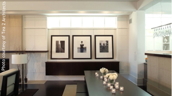
 “The three sets of French doors creates a center point for the room without overdoing symmetry. The chandelier flares out from the center, creating both a groundedness and lightness in this space.”
In this home by Taylor Lombardo Architects, “the larger center arch not only 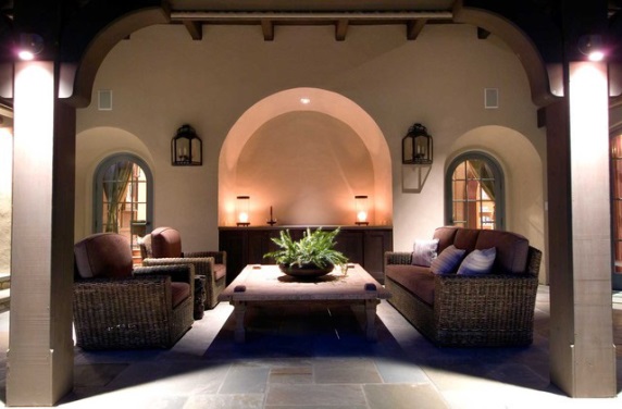 accentuates the room’s center, but its raised height gives the room a loftiness that isn’t literally there. The room not only has added depth, but the illusion of added height.” Read More
Composition
With interior design, the Rule of Three can be implemented in progression and spatial composition. Consider the work triangle in kitchen design, color and fabric schemes, arrangements of furniture, and groupings of accessories.
For more inspiration, see Freshome Design and Architecture Magazine’s recent article “10 Designs That Incorporate the Rule of Three”
They demonstrate how to arrange furniture, tabletop objects, and artwork and provide examples of why the Rule of Three is not a hard-and-fast rule. There are times, such as in a small space, where it may make more sense to successfully “break” the rule.


There are no comments yet, but you can be the first